











What we build

Websites

Company websites and B2B platforms on WordPress or custom builds, with design, audits and speed optimisation.

Website development →

What we run

SEO

Visibility in Google and in language models. One team looks after search, your business profile and what ChatGPT and Gemini say about your brand.

Search engine optimisation →

What we run

Advertising and campaigns

Campaigns judged on net profit after returns and cost of goods, not on the ROAS in the ad platform. Creative is made in-house, so it never waits for a third supplier.

Digital marketing agency →

What we run

Analytics and data

Measurement first, decisions second. Ad, store and warehouse data in one place, so a budget conversation takes fifteen minutes, not three meetings.

Web analytics for e-commerce →
Article

8 Best Practices for Designing User-Friendly Forms

A form nobody abandons: only essential fields, a single column, clear validation and sensible labels. Discover 8 practices with examples.

Dawid Kabała Dawid Kabała Team Leader Creative Designer 8 March 2022 3 min read 8 sections
8 best practices for designing forms Design
Trusted by

We come across forms every day: shopping online, setting up accounts on social platforms, filling in documents. If a form is going to help you achieve a specific business goal, you need to make sure it's as well optimised for the user as possible, since nobody likes filling in paperwork. Read the tips below and make your forms more user-friendly.

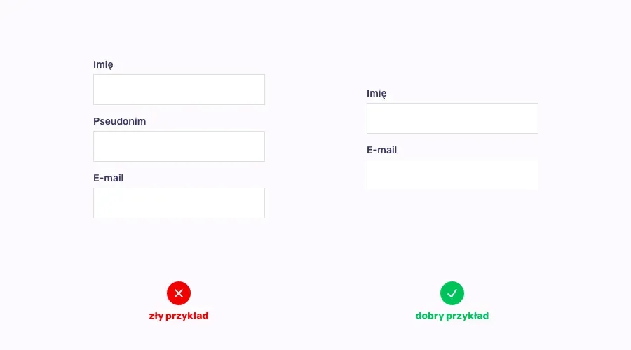
Ask only for essential data
Ask only for essential data

The more fields a form has, the more reluctant people are to fill it in. A form that's too long is one of the most common causes of abandoned carts, so only ask the user for data you actually need to achieve your business goal.

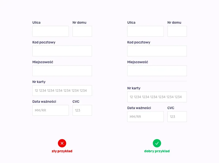
Group fields into logical blocks
Group fields into logical blocks

Especially with more extensive forms, it's worth considering splitting the layout into logical blocks, for example delivery information clearly separated from the personal details section. This makes it easier for users to fill in the whole form.

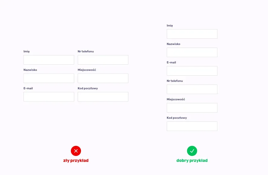
A single-column form
A single-column form

A single-column form is easy to read, greatly reduces the chance of a field being missed, and looks best on mobile devices. There are, of course, moments when it's better to place a few fields side by side (for example, street name next to house/flat number), so you always need to adapt the field layout to your own needs, but when you look at the layout of the whole form, a single column is the most optimal solution.

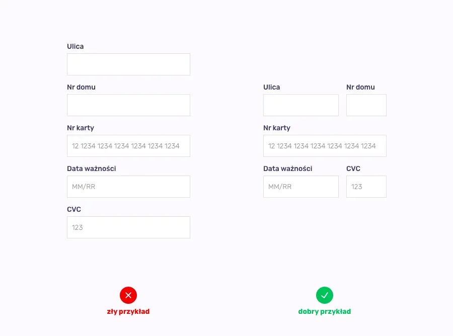
Match field length to the amount of content

Building on the previous point, always try to match the size of a form field to the amount of content that needs to be entered. Having all fields the same width can confuse the user, for example when the field for a street name is the same length as the one for a flat number. On top of that, shortening certain fields lets you save some space by placing them on the same line.
Match field length to the amount of content

Clear validation

If you care about designing a user-friendly form, make sure error messages are simple and logical. Clearly mark a field filled in incorrectly and explain to the user, in an understandable way, how to fill in the form correctly.
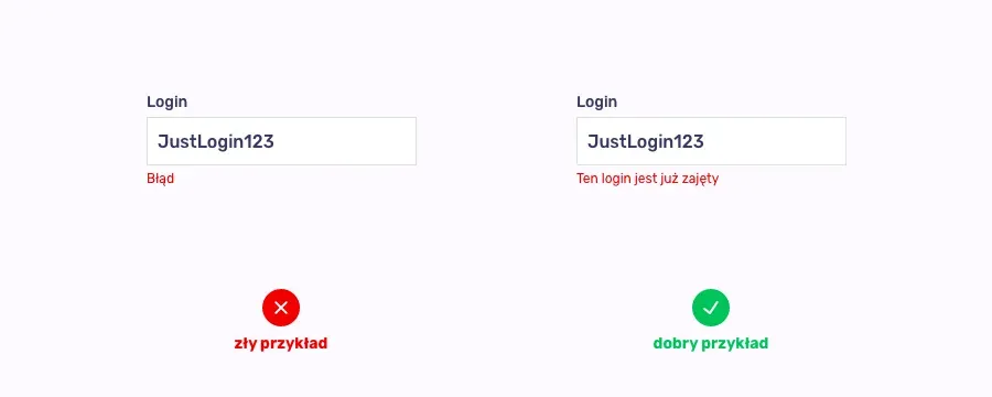
Clear validation
Clear validation

Think about labels

When designing a form, pay attention to form labels. Make sure the label text is simple and short, and place it above the field to be filled in. Also remember to keep proper spacing, so there's no confusion about which label belongs to which field.
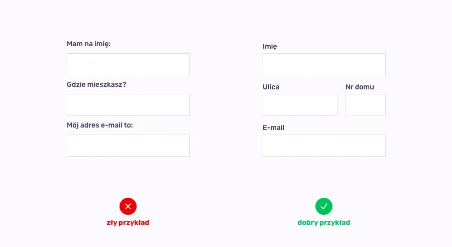
Think about labels
Think about labels

Call to action

Avoid generic messages on buttons. Always try to make CTA text a clear message that explains exactly what will happen when the button is clicked.
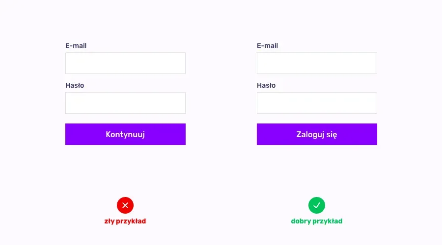
Call to action
Call to action

Radio buttons instead of a drop-down menu

The rule of thumb is that if there are fewer than 6 options to choose from, radio buttons placed one under another work better than a drop-down menu, which requires an extra action to see all the available options.
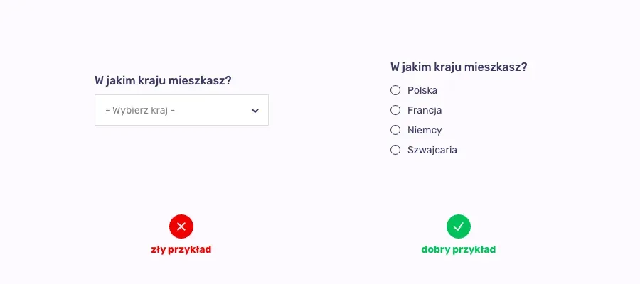
Radio buttons instead of a drop-down menu

Building websites is a very complex process that requires knowledge from many fields. If you feel you need help with this, our interactive agency will be happy to support you at every stage of planning your business online.

Dawid Kabała
Written by
Dawid Kabała
Team Leader Creative Designer

Have a question about this article? Write to us.

Want this in your business

Let's turn this knowledge into results in your store

30 minutes about your numbers. The call starts with someone from sales, and we bring in the channel specialist once we get into the details. The call is free of charge.

Client reviews

Ratings of the agency that runs this blog

Clients gave them after working with us, and you can read each one on the site where it was posted. They cover the work of the whole agency, not this one article.

4.96 / 5
weighted average of 224 reviews across three platforms
Read the reviews

Statuses awarded by the platforms: PrestaShop Expert ★★★, Google Premier Partner 2025, Meta Business Partner, Microsoft Advertising Elite Partner 2025. All certificates and awards

Contact

A conversation about your numbers: 30 minutes

The call is led by a new business specialist. When we get into the details of an account, the specialist for that channel joins in. We reply within one business day.

A quick review of your tracking and campaignsThree priorities for the next quarterA written summary that stays with you

Before the meeting we review your website, your visibility and what your campaigns show from the outside. We will not open with “so, what does your company do?”.

4.96 224 reviews
By sending the form you agree to the processing of your data in line with our Privacy Policy.

What happens after you send it
01
within 1 business day

We reply to your email

The reply comes from the same new business specialist who will run the call. No qualification form and no call from an unknown number.

02
this week

A 30-minute conversation

We go through your numbers and your questions. If it turns out we are not the right fit, we will tell you straight away.